

Part 1 of this 2-part series covered compiling CSS extension languages like Sass or LESS. If you haven’t read part 1 and aren’t comfortable with that concept, you’ll want to start there.
Rather, if you’re already a pro about compiling your Sass or LESS and want to know how you can start using CSS extension languages and Bootstrap to your advantage, you’re in the right place.
Introduce your code to Bootstrap’s
In part 1, we only got as far as compiling Bootstrap back to what you might get from a CDN. That’s great and all, but we can do more. First, let’s define our own entry point.
Rather than compile Bootstrap right where it sits in your project (be that node_modules, bower_components, or somewhere you downloaded it to), let’s start compiling our own code that happens to include Bootstrap.
Let’s say you installed Bootstrap 4 via npm. Next, let’s create some of our own Sass files. Create a directory called scss, put your first stylesheet in there, and your project should start to look something like this:
- node_modules
    - bootstrap
        - (some other stuff)
        - scss
            - mixins
            - utilities
            - ...
            - bootstrap.scss
    - jquery
    - tether
- scss
    - styles.scss
- index.html
- package.json
Sass/SCSS uses a concept called “imports” to let you pull files into one another at compile time. In styles.scss, we’ll want to direct it to do an import of boostrap by adding the following line:
@import '../node_modules/bootstrap/scss/bootstrap.scss'
Now via your compiler of choice, instead of compiling the main Boostrap file, instruct it to compile your file. Compile, and your output should really look more or less the same. Not all that thrilling yet.
Now you could start adding your own CSS or Sass/SCSS below that line, and on compilation, it’ll appear below all of Bootstrap’s styles! Give it a try, and then come back.
Now while this works just fine, a seasoned programmer will see this as a chance to partial out CSS in a meaningful way. Consider making this file purely for importing other files that contain atomic CSS.
Take advantage of Bootstrap variables
If you navigate into path_to_bootstrap/scss, you’ll find a couple of files called _variables.scss and _mixins.scss. These two files contain a lot of helpful variables and functions that Bootstrap uses throughout its source, and it directly reflects the Bootstrap Customizer. You can start customizing these variables and using these functions in your own code.
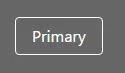
Open up your index.html file, which should already reference your compiled stylesheet, and drop in a Bootstrap button:
<button type="button" class="btn btn-primary">Primary</button>
If you open this in your browser, you’ll get the all-too-familiar Bootstrap button.
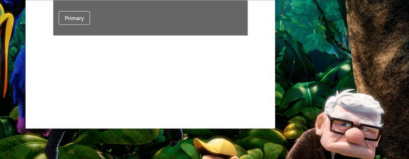
Next, create your own _variables.scss file alongside your styles.scss file. At the top of this file, write the following:
$brand-primary:orange;
And at the top of your styles.scss, add the following:
@import './variables';
With Sass, the leading underscore allows us to omit the file extension and get our import just like the above. Compile again and reload in browser and you should get the following:

When Bootstrap defines the styles for a button, rather than use hard-coded values, they use the variables that have been set in their own _variables.scss. And in that file, you’ll see that all the values are marked with !default. This means that if the value has already been defined elsewhere when it gets to these values, the previous value will be used. Since we defined our own variables ahead of Bootstrap’s, our value was used.
What we’ve gained here is a way to take everything already existing in Bootstrap and give it our own spin to match our brand look and feel, all in one fell swoop. Furthermore, if I want to use my brand’s primary color elsewhere in my own styles, I simply have to reference that same variable, or even define a new variable that references it, depending on the situation.
/* option 1 */
$brand-primary:orange;
.text-with-color {
    color:$brand-primary;
}

/* option 2 */
$brand-primary:orange;
$widgets-inc-primary: $brand-primary;
.text-with-color {
    color: $widgets-inc-primary;
}
Some people will copy Bootstrap’s entire _variables.scss file to their own and start customizing, but I find this messy, so I only grab the ones I need. Before moving on, try to change up the font being used (hint: the Bootstrap Customizer is a great resource if you’re more comfortable with it than searching Bootstrap’s variables file).
Great Bootstrap mixins
These variables are great and make Bootstrap extensible, but if you needed some in your own code, they aren’t that hard to make. Let’s talk about something a bit more frustrating to scaffold yourself: mixins.
Mixins are Sass’s version of functions. They take arguments and output CSS based on those arguments. Just like functions in true programming languages, they’re great for repetitive blocks of code. Let’s take a look at some of Bootstrap’s built-in mixins that you might find yourself using.
Making new Bootstrap buttons
Bootstrap 3 doesn’t come with a ghost button out of the box, which is a super trendy design element recently. Because Bootstrap’s buttons all retain the same shape and size qualities, they use a mixin to create new ones based on variable colors. You can, too.
After the Bootstrap import, add the following to your styles.scss (or create a _buttons.scss and import it!):
.btn-ghost {
    @include button-variant(white, rgba(0,0,0,0), white);
}
And then in your index.html, remove the btn-primary class on the button and add btn-ghost. Go ahead and compile your styles and refresh in the browser.
You’ll notice I gave the background a color to make the effect easier to see. Sorry to say if you want a color-inverting hover state, you’ll have to add that yourself. Bootstrap’s default behavior darkens the background.
Bootstrap 4 brings us breakpoint mixins
In Bootstrap 4, we get another great mixin for quickly generating media breakpoints. Now we can swap out our button’s color based on the screen size:
.btn-ghost {
    @include button-variant(white, rgba(0,0,0,0), white);
    @include media-breakpoint-up(md) {
        @include button-variant(orange, teal, orange);
    }
}
There are lots of articles that cover a variety of Bootstrap’s many mixins. If you’re feeling ambitious, just navigate to scss/mixins in the Bootstrap source and start poking around in files for potentially useful things. And of course, you can always write your own mixins for patterns you end up reusing a lot. There are whole libraries out there dedicated simply to mixins.
Take only what you need!
The last thing I want to cover is how to only use the bits and pieces of Bootstrap you need and keep your filesize down. Sure, you could use a gulp task that strips unused CSS out of your end stylesheet, but just in case, let’s talk about using less Bootstrap from the get-go.
If you open the Bootstrap file we’ve been importing, you’ll see that it simple contains a bunch of other imports—a pattern I already encouraged you to adopt. Rather than pull all of this in, we can pick and choose. Go ahead and copy this entire file and replace the single Bootstrap import currently in your styles.scss. Next, update the file path on each import to point to the file relative to the new location. You should end up wtih something like this:
@import './variables';

/*!
 * Bootstrap v4.0.0-alpha.5 (https://getbootstrap.com)
 * Copyright 2011-2016 The Bootstrap Authors
 * Copyright 2011-2016 Twitter, Inc.
 * Licensed under MIT (https://github.com/twbs/bootstrap/blob/master/LICENSE)
 */

// Core variables and mixins
@import "./../node_modules/bootstrap/scss/custom";
@import "./../node_modules/bootstrap/scss/variables";
@import "./../node_modules/bootstrap/scss/mixins";

// Reset and dependencies
@import "./../node_modules/bootstrap/scss/normalize";
@import "./../node_modules/bootstrap/scss/print";

// Core CSS
@import "./../node_modules/bootstrap/scss/reboot";
@import "./../node_modules/bootstrap/scss/type";
@import "./../node_modules/bootstrap/scss/images";
@import "./../node_modules/bootstrap/scss/code";
@import "./../node_modules/bootstrap/scss/grid";
@import "./../node_modules/bootstrap/scss/tables";
@import "./../node_modules/bootstrap/scss/forms";
@import "./../node_modules/bootstrap/scss/buttons";

// Components
// @import "./../node_modules/bootstrap/scss/animation";
// @import "./../node_modules/bootstrap/scss/dropdown";
// @import "./../node_modules/bootstrap/scss/button-group";
// @import "./../node_modules/bootstrap/scss/input-group";
// @import "./../node_modules/bootstrap/scss/custom-forms";
// @import "./../node_modules/bootstrap/scss/nav";
// @import "./../node_modules/bootstrap/scss/navbar";
// @import "./../node_modules/bootstrap/scss/card";
// @import "./../node_modules/bootstrap/scss/breadcrumb";
// @import "./../node_modules/bootstrap/scss/pagination";
// @import "./../node_modules/bootstrap/scss/tags";
// @import "./../node_modules/bootstrap/scss/jumbotron";
// @import "./../node_modules/bootstrap/scss/alert";
// @import "./../node_modules/bootstrap/scss/progress";
// @import "./../node_modules/bootstrap/scss/media";
// @import "./../node_modules/bootstrap/scss/list-group";
// @import "./../node_modules/bootstrap/scss/responsive-embed";
// @import "./../node_modules/bootstrap/scss/close";

// Components w/ JavaScript
// @import "./../node_modules/bootstrap/scss/modal";
// @import "./../node_modules/bootstrap/scss/tooltip";
// @import "./../node_modules/bootstrap/scss/popover";
// @import "./../node_modules/bootstrap/scss/carousel";

// Utility classes
@import "./../node_modules/bootstrap/scss/utilities";


.btn-ghost {
    @include button-variant(white, rgba(0,0,0,0), white);
    @include media-breakpoint-up(md) {
        @include button-variant(orange, teal, orange);
    }
}
What this allows you to do is to start commenting out the parts you don’t need. In my work, I end up developing a lot of brochure-ware sites. These are heavily branded, and I don’t end up using Bootstrap for a whole lot more than the grid and some normalization. For this reason, I comment out all of the components by default, which you’ll see reflected in the example above. For everyone keeping score at home, this reduced the unminified filesize from 123KB to 63.2KB—nearly a 50% savings.
And just like that, you’re using Bootstrap like a pro. Know of some tips and tricks you didn’t see here? Drop them in the comments for the rest of the class.
Leave a Reply