How Sterner Stuff Made Truffle Tickets More Tantalizing
My first meeting with the folks at the Oregon Truffle Festival was after the January 2016 festival. The website still begged “Buy Tickets!” even though the event was over. Nobody could quite remember how to turn the button off. Had it been automatic?
Working with their previous developer, they were able to remove this button, but it was a sign of a larger problem: the site, from an administrator’s perspective, was difficult to use. Updating the site for each year’s new schedule was a full-time job. A lot of that time was duplicate work to make sure the same information was displayed everywhere. There were too many opportunities to post conflicting or outdated information.
And of course, anyone selling anything online wants to sell more of it.
So this year’s work set out with two goals in mind: Make the site easier to update going forward, and make the ticket buying process as simple as possible.
Better upselling
The Oregon Truffle Festival is made up of two weekend festivals with several events during each. For the festival producers, the tickets are ideally sold in several predefined packages rather than one-at-a-time. Many events don’t even have solo tickets.
But on the existing website, ticket packages and single tickets were all effectively the same thing, existing in the website as “Events”. This made it impossible to promote ticket packages over single tickets. The data needed to be handled differently.
Events were reworked to contain only that—events. For ticket packages, we created a new data type called “Packages”. A package could be assigned any number of events, so when a user was looking at a package, it was clear what events were included with their purchase.
This made it easy to prioritize packages over single tickets for each festival. Buying a package encourages users to travel into Eugene or Newberg for a couple days and hopefully spend money with various event sponsors and lodging partners. Selling more of these packages makes sponsorships much more appealing to businesses and donors that help make the event possible.
Did it Work?
One of OTF’s most popular ticket packages sold out much earlier than in previous years. Things were off to a stronger start than ever thanks to an easy-to-use customer experience.
Many Thanks to Our Sponsors
Sponsoring businesses are what keep the OTF running, especially with its new non-profit status. In past years, the sponsors page didn’t contain much information and offered little value to sponsors:
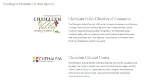
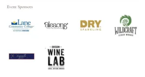
The sponsor got one logo on one page of the website, which should be a dynamic marketing tool! So we implemented some improvements. Many sponsors were specifically sponsoring events. By tying sponsors to events, we were able to not only flesh out the existing sponsors page, but also able to feature the sponsors in many other places on the website. This increase in visibility should ensure existing sponsors see a bigger return on their investment, and serve as a way to bring in new sponsors in the future.
Work Smarter, Not Harder
Getting things in place this year took a couple days of heads-down collaborating at the OTF office, but the payoff is huge. Information that once had to be entered multiple times across the WordPress admin, such as event descriptions, package details, prices, and more, are now entered in a single, logical place. By relating data—like guests to the events they’ll be at, or events to the weekend they’ll be happening at—the information can be pulled into many different templates without being repeated in the admin.
Similarly, both packages and (many) events are “ticketable”. The OTF sells tickets off-site, so several attributes are available to both events and packages, including pricing, early bird pricing, ticket purchase URL and whether or not tickets are sold out. This creates a uniform editing experience across every kind of ticket on the website, and an easy-to-use purchasing experience for users no matter what kind of ticket they want.
And the team is already prepared for next year. Without any hard-coded dates and with an easy-to-update admin interface, the team can update the site on the fly without waiting on a turnaround from Sterner Stuff.
Responding to Customer Feedback
People often forget that when designing a new website, you can be designing in a bubble. What may be obvious to you and your staff may not be clear to your users. Sterner Stuff’s experience and expertise in the field can help catch many of these oversights before they make it to production, but that’s not always the case.
There are two ways you can address that problem. The first is to do some research beforehand. Alternatively, you can go to market and respond on the fly.
We weren’t actually changing much on the home page, so we went with what was already done and launched to get feedback. The day tickets went on sale, some customers quickly told us that they couldn’t figure out how to buy tickets! What was the problem?
First, let’s take a look at the top of the home page:
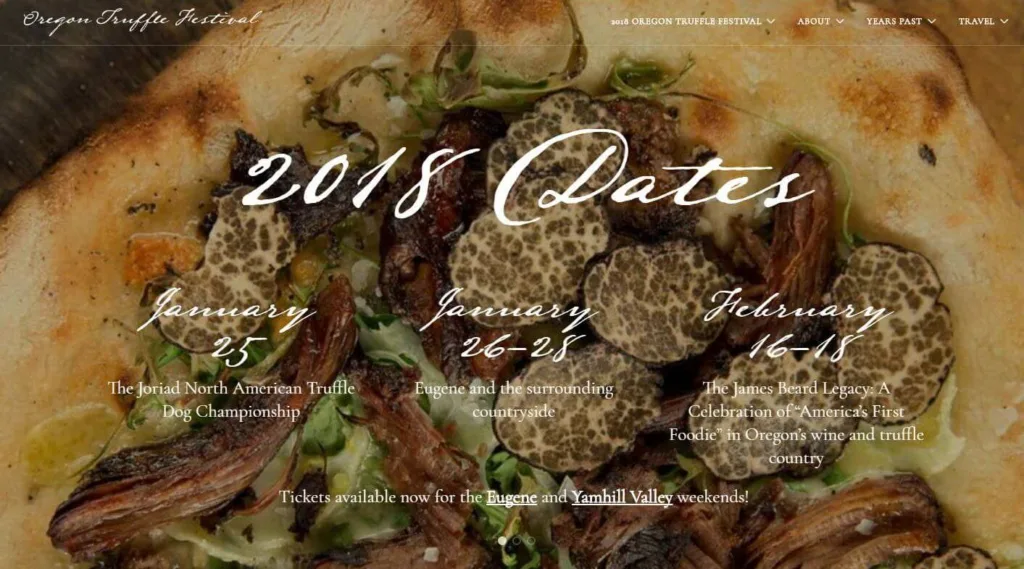
If you look really hard, you can see there’s a nav menu item with a dropdown for the 2018 festival. By clicking through to one of the festivals from this menu, you can easily find tickets, but it wasn’t clear to users that this link would get them there. Ultimately, we added “& Tickets” to the end of that menu item, but I firmly believe there was a bigger problem.
See the links at the bottom of this screenshot? Or did I just draw your attention to them? The text clearly implies that those are ticket links, but users weren’t finding those either. Here’s the deal:
Hero Images are Really Bad at Relaying Information
In fact, before it had links to purchase tickets, the message at the bottom of that image advertised the on-sale dates for tickets. Even so, the team was consistently fielding questions about that date as well.
The moral of the story is that as popular as these big hero images are, important information shouldn’t be laid over them. Users ignore everything here. It’s ambient white noise. Also keep in mind that nav menus should be a last resort for users. If you have a top task you want them to complete (such as purchasing a ticket), don’t relegate the path to success to a navigation menu link.
Let’s hop down the page a bit further:
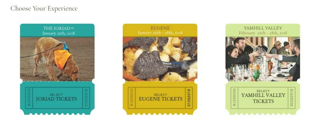
These three ticket stubs are actually links to each event, but it turns out this wasn’t clear to users either!
Ultimately, I told the OTF team that no one would ever complain that the links to buy tickets were too obvious. I suggested, and implemented, old reliable: a high-contrast button.
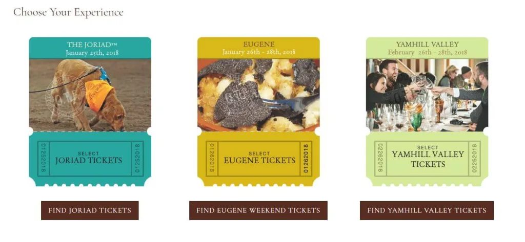
We haven’t heard anything else from users unable to buy their tickets. Is it the prettiest thing that ever existed? Perhaps not, but would you rather something pretty, or something effective and helpful?
Wrapping Up
I may be paraphrasing a bit, but as we worked on this project, one of the event organizers said:
The site always should have worked this way. This is stuff we just couldn’t do last year because we didn’t have you.
Don’t worry folks—just doin’ my job.
Sterner Stuff brings a skill set that most WordPress developers don’t have. Lots of folks can install a theme and plugins. They’ll drag-and-drop to your heart’s content. But Sterner Stuff is equipped to build a site that works the way you and your users need.

