

This is part 2 in my series on slow websites, what causes them, and how to fix them. Read part 1 here.
Big images are all the rage in web right now. Seems like you can’t turn around without finding high-res hero images and videos. And there’s nothing wrong with these. They generally look great and, used well, can help set the tone for a brand.
But WordPress makes abusing large images such as these dangerously easy. Out-of-the-box themes let you upload massive, full-page splash images without making any efforts to optimize them. Even images displayed small on your website can hide a multi-megabyte download.
Fetching images, videos, audio and other media from your server that measure in megabytes slows down your site. If you read part 1, you know what a request is. Getting each of these elements requires a request.
What’s more, most combinations of browsers and servers will only handle around 8 requests at a time. Remember downloading songs on dial-up? Same idea. If you try to download 20 songs, only a few can be downloaded at one time. If one of the songs being downloaded is really big, that slows everything else down. Same thing for your images and other media.
There are a couple of ways you can avoid this trap, and a lot of it can be done without your web developer! Let’s touch on those things first.
Optimize Your Images
Optimizing images can mean a lot of things, but we’ll try to cover a few. From creating the image to uploading it, there are things to consider, so we’ll go in the order you’re likely to be working.
Sizing Your Image
When exporting from Photoshop or your editor of choice, consider the size of the space the image is ultimately going to go in. Will it be a splash image? Perhaps 1200px is wide enough. Or do you foresee many of your users being on massive desktop monitors? That might mean bumping up to 1900px. I wouldn’t go much wider than that. Anyone spreading your site over two monitors can suck it up.
Perhaps, rather, your image will be dropped alongside content in a blog post. Probably no reason it needs to be much larger than 600px wide in this case, so export it as such.

Take, for example, the featured image on this page. I originally sourced it from Gratisography after searching a few outlets on The Stocks. The original download was over 5000px wide and over 7 megabytes in size, which makes sense if you’re a supplier of stock photography—you want it to work for any number of applications. My server configuration wouldn’t even let me upload this thing. I got a timeout. I opened it in GIMP and sized it down to 3000px wide. While the smaller size was a good move, this actually resulted in a larger file, so good on Ryan at Gratisography. More on this later.
If you’re a photographer, you have an excuse for massive, high-resolution images. However, your user probably doesn’t need the highest resolution on page load. If they want the original, they’ll look for it. This is a good time to have two versions of the image—one saved smaller for the space on the web page, and the full version to be linked to directly, perhaps for download.
Saving Your Image
When exporting an image, most image editors will prompt you for a file format. When saving as a JPEG, it will also ask you for the quality to be saved at. Focusing on Photoshop, the web is rarely a good medium for the highest quality export. “Very High” is usually good enough. You might even get away with less if the image will have a slightly opaque color overlay, like in many of the splash examples linked to above.
Consider the featured image for this post. Remember how I actually got a bigger file when I sized it down? This is due to image quality intricacies. The first time, I saved it at 100 quality. By dropping this to 90, nearly indiscernible, I ended up with a 2.7 megabyte image, which is almost 5 megabytes smaller than the original. That solved my timeout problem and I got it uploaded no problem.
Next, consider file format. If your image has important transparency, you can’t escape using PNG. PNGs are also good for images with only a few colors, like illustrations. For photographs, however, your most efficient option is a JPEG. If you can get a WebM version of the image, that’s also a great option. You’ll notice the featured image on this page is a JPEG.
Finally, if your image is a vector image (such as an SVG or Illustrator-based image), these are a great option as they are very small, describing geometric formulas rather than pixel-by-pixel image data. Out of the box, WordPress doesn’t allow you to upload SVGs. This great plugin allows for SVGs in your media library, plus some advanced features you can read about if you need them. Keep in mind that SVGs have inherent security risks, so don’t let anyone that you don’t explicitly trust upload them.
Those are probably the only image formats you should ever use on the web. Stay away from anything like TIFF or BMP, as these are extremely high quality formats. Once again, a direct link for photographers or design-related work may be the only good excuse.
Uploading Your Image
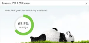 Photoshop and other editors do a pretty fair job of optimizing images when saved for the web, but they could be better. To cover all your bases, look into automated image compression. Every WordPress website launched at Sterner Stuff comes set up with TinyPNG. TinyPNG takes every image uploaded, at every image size, and compresses it even further. From your WordPress dashboard, you can even monitor your savings! The Sterner Stuff website, as of writing, has reduced its images by 65% overall.
Back to the featured image on this page, TinyPNG made quick work of it as soon as I uploaded it. The image now measures in at 1,011 kilobytes—under 1 megabyte. Don’t forget that the original was over 7.
TinyPNG has some competitors that I don’t like as well, but still do a great job, including Kraken and Smush. For more information on configuring these tools, sign up for Sterner Stuff’s free “WordPress for Small Business Owners” email course. Images are covered in lesson 3!
Image Optimization For Your Developer
If you find that the above hasn’t done enough to speed up your website, you can talk to your developer about some more options for optimization. Further, if you don’t have a developer, feel free to touch base for a consultation!
WordPress Image Sizes
Perhaps you plan on using your image in multiple places. Sometimes, a 1200px wide image is appropriate, but other times, you just need 500px. Exporting the image multiple times from your image editor is a pain. Fortunately, WordPress ships with a feature called “image sizes”.
Developers use this feature to define a set of dimensions that every image that gets uploaded should be cropped to. When rendering different page templates, the developer can then explicitly choose which size to use. So even if the end user uploads a 3000px wide image, the developer can make sure to use a version that’s only 500px wide when appropriate. The 1200px version and maybe even the 3000px version can then be used elsewhere. That’s a huge improvement, and a big advantage of having a custom WordPress theme developed specifically for your business.
Let’s go back to this post’s featured image. Images I upload to the Sterner Stuff website are cropped specifically to fit in that space (1200px by 500px, to be exact). That way the image is only as large as it has to be. If you view the blog archive, you’ll see featured images presented with a 300px wide version—even smaller!
After WordPress cropped my upload, it was 177.4 kilobytes in size. That by itself is about a 94% savings over the resized original, to say nothing of the monster I originally downloaded. That’s then run through TinyPNG, which sizes it down further to 152.8 kilobytes. If you’re keeping score at home:
| Optimization | Size |
|---|---|
| None (original download) | 7MB |
| Resized at Full Quality | 8MB (oops) |
| Resized at 90/100 Quality | 2.7MB |
| Automatic resize to “Post Featured” image size | 177KB |
| “Post Featured” image size and TinyPNG | 152KB |
And the image on the blog archive? It’s under 20KB.
Image Sizes in Your Blog Content
Unless coded in a certain way, these image sizes won’t show up in the media uploader for insertion. Due to the generic nature of formatting blog posts, this is usually okay. You’ll be fine making good use of WordPress’s built-in image sizes.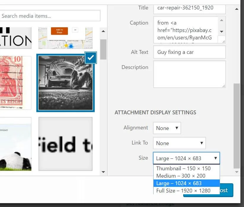
Responsive Images
Responsive images are a new idea, simple in concept and complex in execution. The problem is that an image that might need to be 800px wide on a desktop computer only needs to be as wide as someone’s phone when viewed there, and maybe less! How can we serve up the most appropriate image size to mobile users?
Enter responsive images.
When talking about responsive images, the first line of defense, and the one that generally suffices, is the traditional img tag using a new attribute: srcset. This attribute lets you define a collection of sizes of an image as well as how much space they are expected to fill. The browser will then pick the most appropriate one and serve it to the end user. WordPress actually automatically does some of this for your image sizes with similar dimensions.
If you need to more explicitly declare which images to use at which screen sizes, the picture element may be more appropriate. This use-case is called art direction. While the syntax and results of these two implementations are similar, the strict picture tag should only be used when exact definition is important.
This article from Eric Portis does a great job of describing implementation details of these two concepts, while I find this one from Jason Grigsby to make a strong argument for the two different use cases.
Ready for more?
The next post in the series will focus on how plugins can slow down your website. It will also discuss some ways to look for well-written plugins. There will be content for both developers and non-developers. Want to know as soon as it goes live? Sign up for the Sterner Stuff newsletter below!
Leave a Reply to Danny Cancel reply